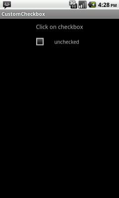
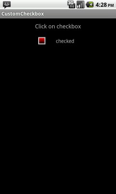


In this example creating a checkbox and using style to give custom look.
Using selectors to call checkbox checked state xml and unchecked state xml.
Using xml file to create shape with the use of gradient,stroke tags to give custom look for checkbox checked and unchecked state.
    import android.app.Activity;
    import android.os.Bundle;
    import android.view.View;
    import android.view.View.OnClickListener;
    import android.widget.CheckBox;
    import android.widget.TextView;

    public class CustomCheckbox extends Activity implements OnClickListener {

        /** Called when the activity is first created. */
        @Override
        public void onCreate(Bundle savedInstanceState) {

            super.onCreate(savedInstanceState);
            setContentView(R.layout.main);

            CheckBox checkb  = ( CheckBox ) findViewById( R.id.checkb );
            checkb.setOnClickListener(this);

        }

        @Override
        public void onClick(View v) {

            TextView output = (TextView)findViewById(R.id.textview1);

            if (((CheckBox)v).isChecked()) {
                output.setText("checked");
            } else {
                output.setText("unchecked");
            }
        }
    }
Define android:button="@xml/custom_checkbox" custom xml for checkbox.
<?xml version="1.0" encoding="utf-8"?>
    <LinearLayout xmlns:android="http://schemas.android.com/apk/res/android"
        android:layout_width="fill_parent"
        android:layout_height="fill_parent"
        android:orientation="vertical" >

        <TextView
            android:layout_width="fill_parent"
            android:layout_height="wrap_content"
            android:textSize="16dip"
            android:gravity="center"
            android:padding="10dip"
            android:text="Click on checkbox" />
        <LinearLayout
            android:layout_width="fill_parent"
            android:layout_height="wrap_content"
            android:gravity="center"
            android:orientation="horizontal">
            <CheckBox
                android:id="@+id/checkb"
                android:layout_width="wrap_content"
                android:layout_height="wrap_content"
                android:layout_gravity="center"
                android:button="@xml/custom_checkbox"/>
            <TextView
                android:id="@+id/textview1"
                android:layout_width="wrap_content"
                android:layout_height="wrap_content"
                android:textSize="14dip"
                android:gravity="center"
                android:padding="10dip"
                android:text="unchecked" />
        </LinearLayout>


    </LinearLayout>
This xml file used for checkbox and called xml file for checkbox checked/unchecked state.
 <?xml version="1.0" encoding="utf-8"?>
    <selector xmlns:android="http://schemas.android.com/apk/res/android">
        <item android:state_checked="true"
              android:drawable="@xml/checked" />
        <item android:state_pressed="true"
              android:drawable="@xml/checked" />
        <item android:drawable="@xml/unchecked" />
    </selector>
Define shape for checkbox checked state.
    <?xml version="1.0" encoding="UTF-8"?>
    <shape xmlns:android="http://schemas.android.com/apk/res/android"
        android:shape="rectangle">
        <gradient android:startColor="#ffff0000" android:endColor="#ff000000" android:angle="270"/>
        <stroke android:width="4px" android:color="#ffc0c0c0" />
        <size android:height="20dp" android:width="20dp"/>
    </shape>
Define shape for checkbox unchecked state.
    <?xml version="1.0" encoding="UTF-8"?>
    <shape xmlns:android="http://schemas.android.com/apk/res/android"
        android:shape="rectangle">
        <gradient android:startColor="#ff585858" android:endColor="#ff000000" android:angle="270"/>
        <stroke android:width="4px" android:color="#ffc0c0c0" />
        <size android:height="20dp" android:width="20dp"/>
    </shape>
Final words- Just download the project and run it using your emulator and if you have any doubts or suggestions, please place them in the comments.
 Facebook Integration - Android Example Android SharedPreferences Basics Play Video File - Android Example Upload File To Server - Android Example Incomming SMS Broadcast Receiver - Android Example